Campaign Work
OOH, Digital & Branding
Brand Design · Multimedia
The Challenge
The Rocketman app had a great product but limited awareness. The ask was clear: create a big idea that could drive downloads and build recognition across multiple media channels.
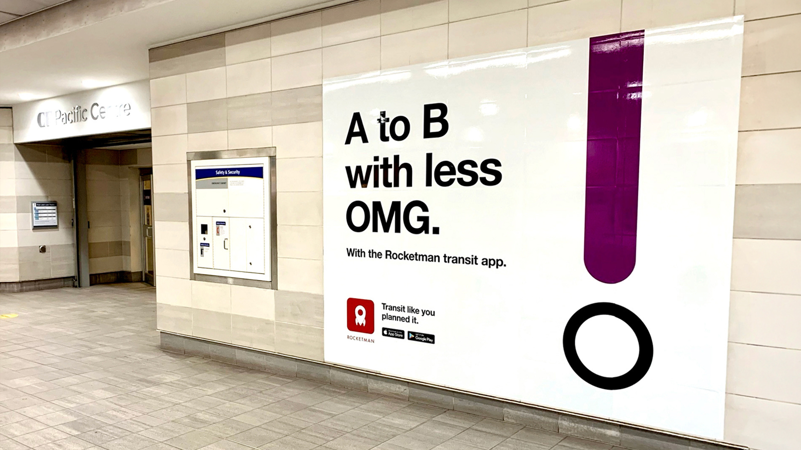
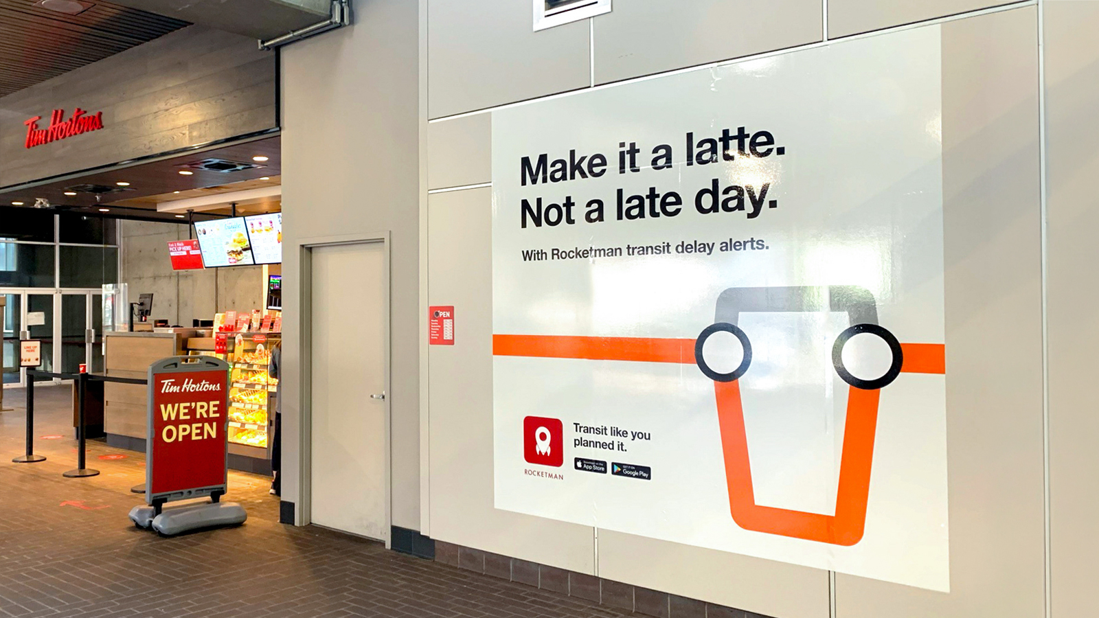
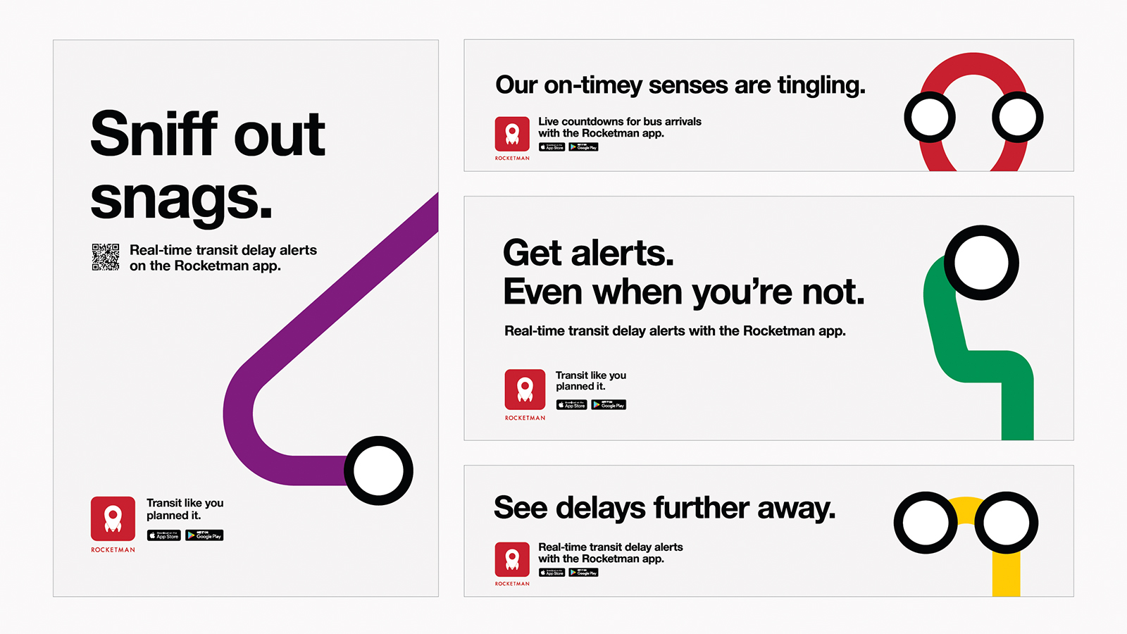
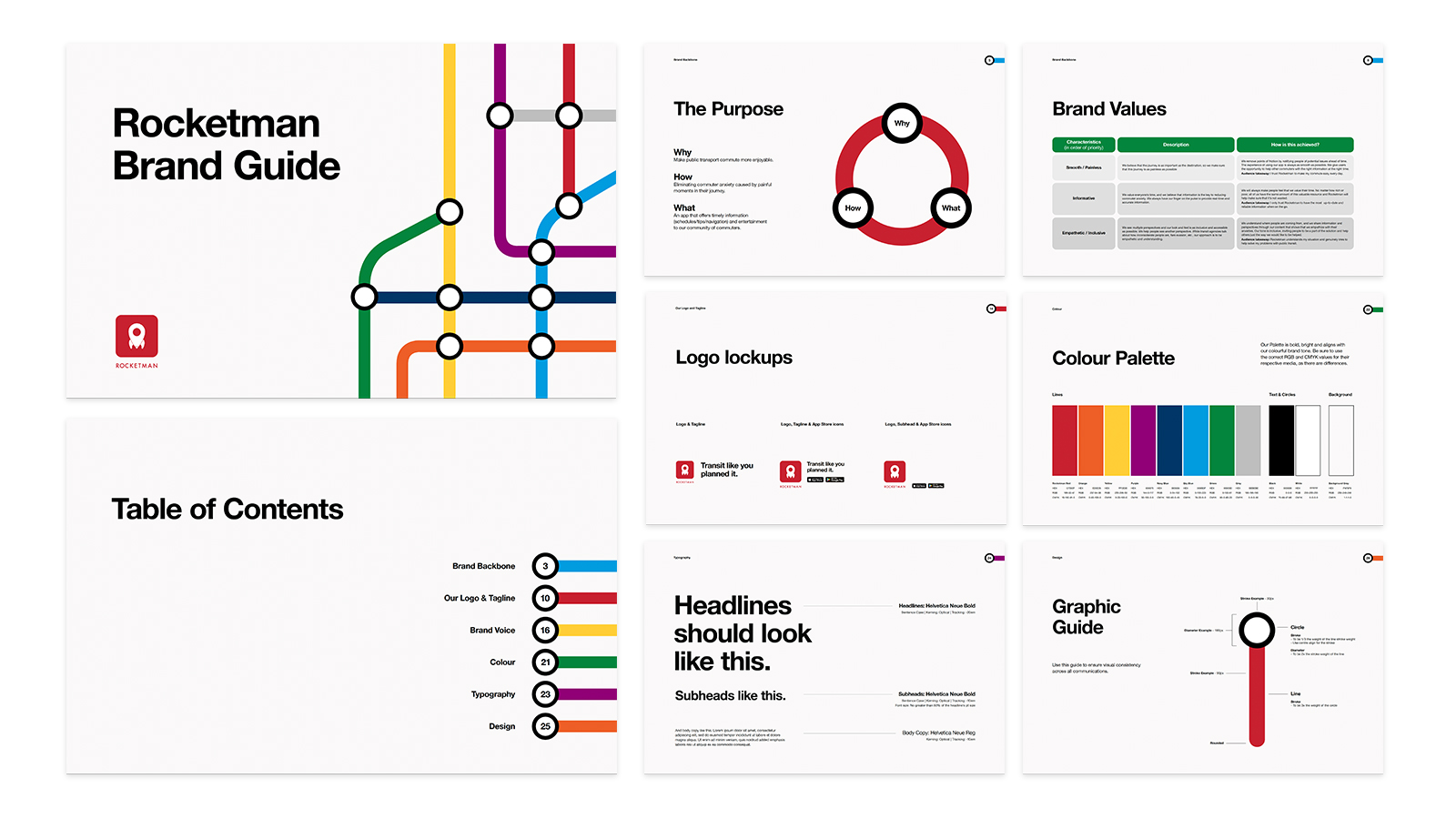
Leveraging the universal visual language of transit map design — colour-coded lines, bold type, clear hierarchy — we created a campaign that felt instantly at home in the transit environments where commuters needed Rocketman most.
The result was a uniquely ownable visual identity that worked seamlessly across out-of-home, transit interiors, and digital placements. The campaign generated a 560% increase in organic app downloads and 501% overall growth.